Nashua Harvest
Some brands begin with a product. Nashua Harvest began with a way of thinking.
Karl approached me with a vision that extended well beyond farming. While the immediate focus was produce, the long-term ambition was to build a practice that could naturally evolve into pantry goods, natural materials, workshops and future crafts, all connected by a shared philosophy rather than a single product category.
That philosophy became the foundation of the entire identity.
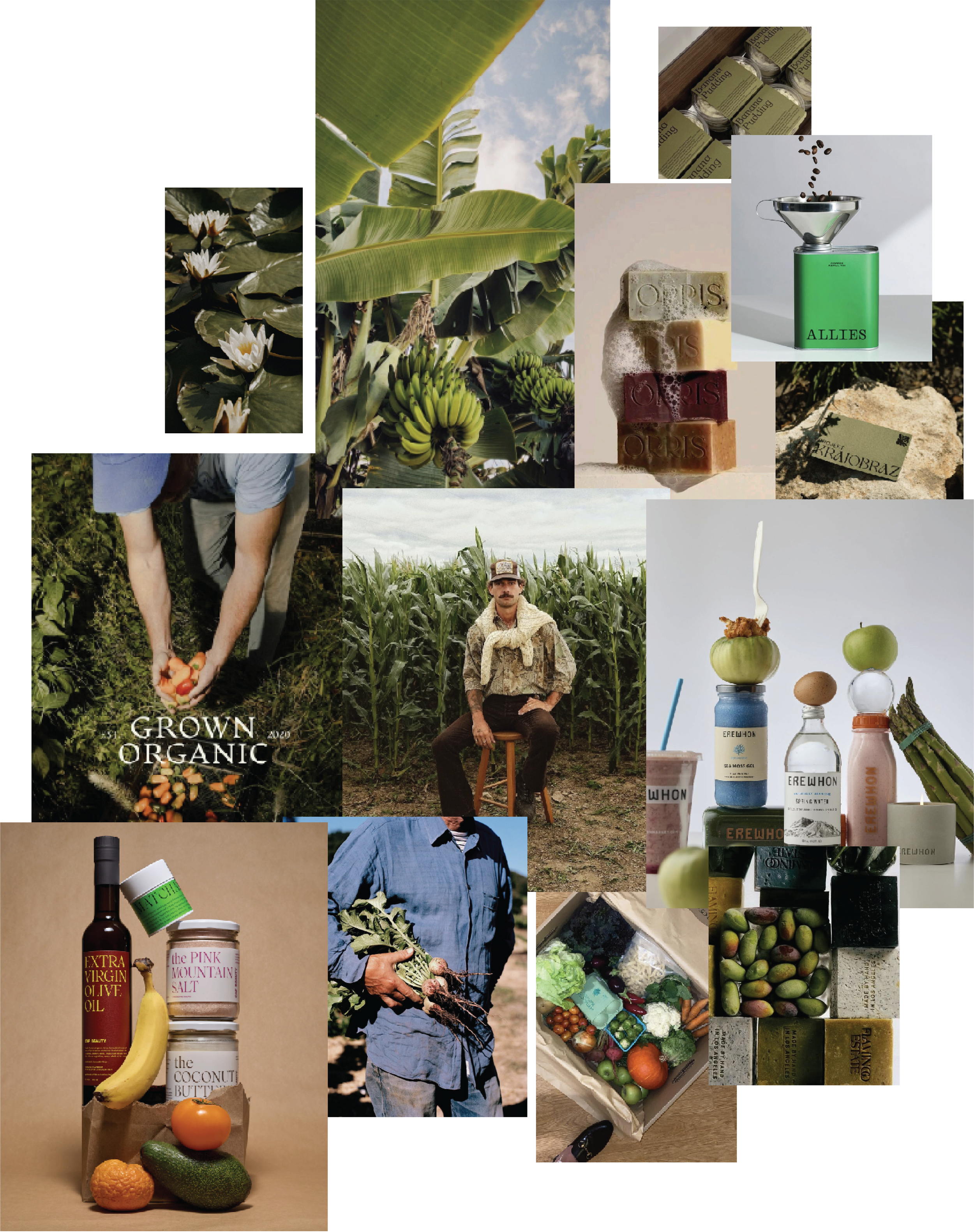
Instead of looking to traditional agricultural branding, I explored references from premium food brands, contemporary wellness, editorial photography and thoughtful product design. The mood board balanced raw documentary imagery with refined packaging, creating a visual language that felt equally at home on a farmers market table or the shelf of a carefully curated concept store.
Throughout the project, one idea continually resurfaced: stewardship.
Not sustainability as a marketing term, but stewardship in its truest sense. Caring for the land with patience, restraint and a long view. That thinking shaped every creative decision, from the typography and photography through to the tone of voice, packaging and merchandising philosophy.
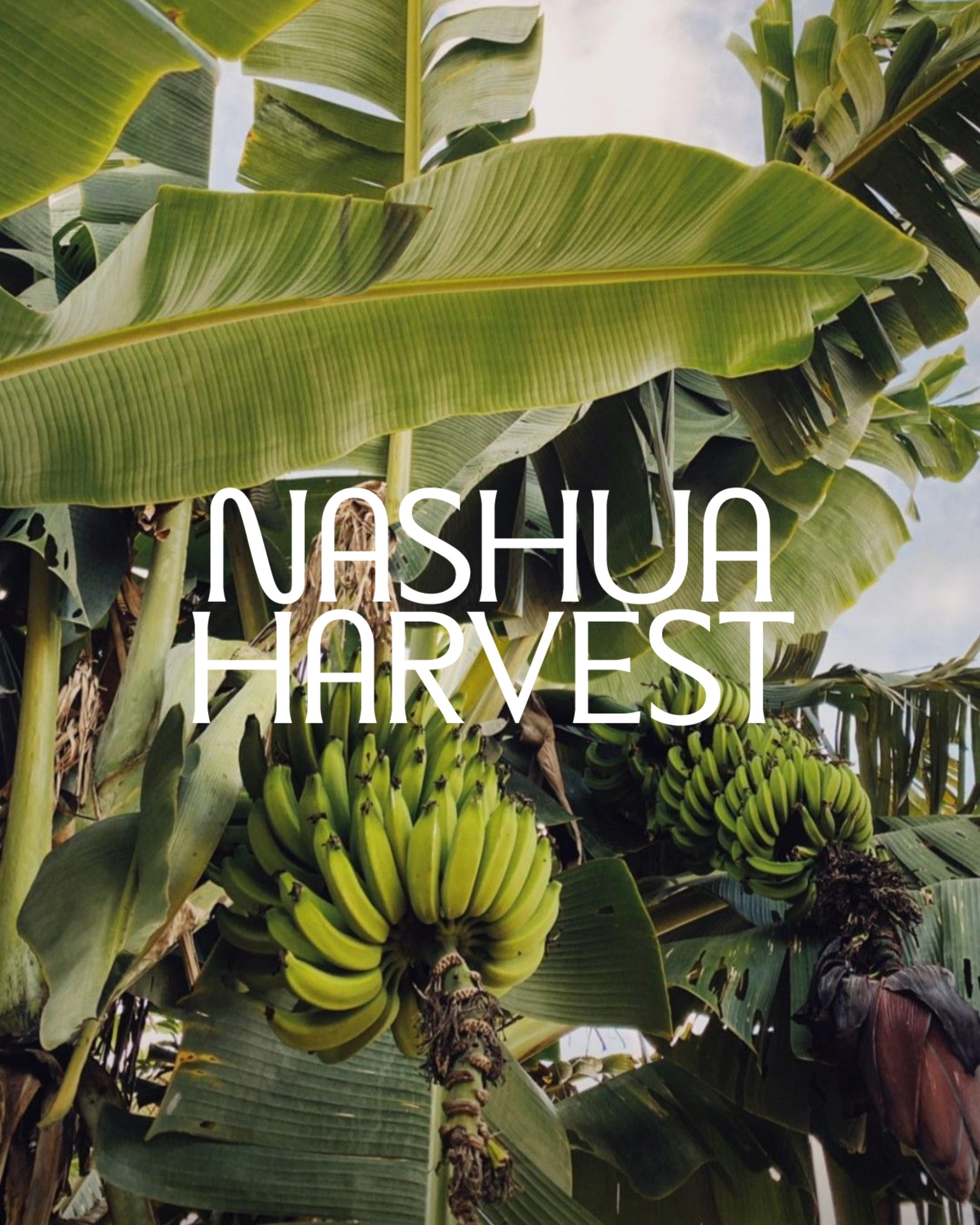
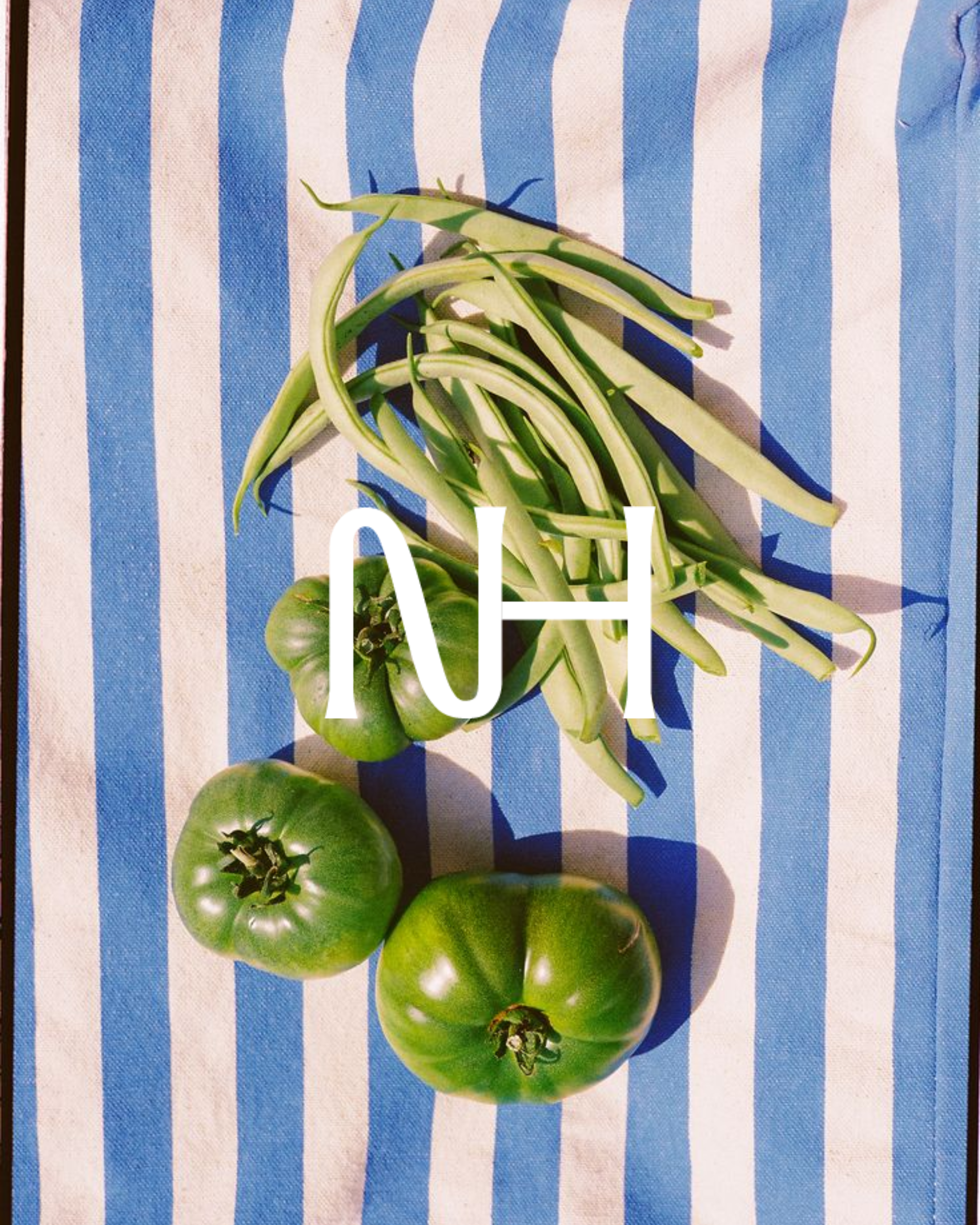
The identity itself reflects that same quiet confidence. A refined custom wordmark draws inspiration from heritage agricultural signage while feeling contemporary enough to grow alongside the business. It feels established without becoming nostalgic, balancing elegance with practicality.
Rather than stopping at a logo, I developed a complete brand system. The project included a scalable identity suite, brand strategy, typography, colour palette, photography direction, packaging concepts, merchandise, website principles and a comprehensive brand bible designed to support the business as it evolves.
The colour palette was drawn directly from Karl's Farm. Greens reference the surrounding landscape and native foliage, while earthy browns and oxidised reds echo the property's soil, clay and weathered materials. Together they create a palette that feels grounded, timeless and unmistakably connected to place.
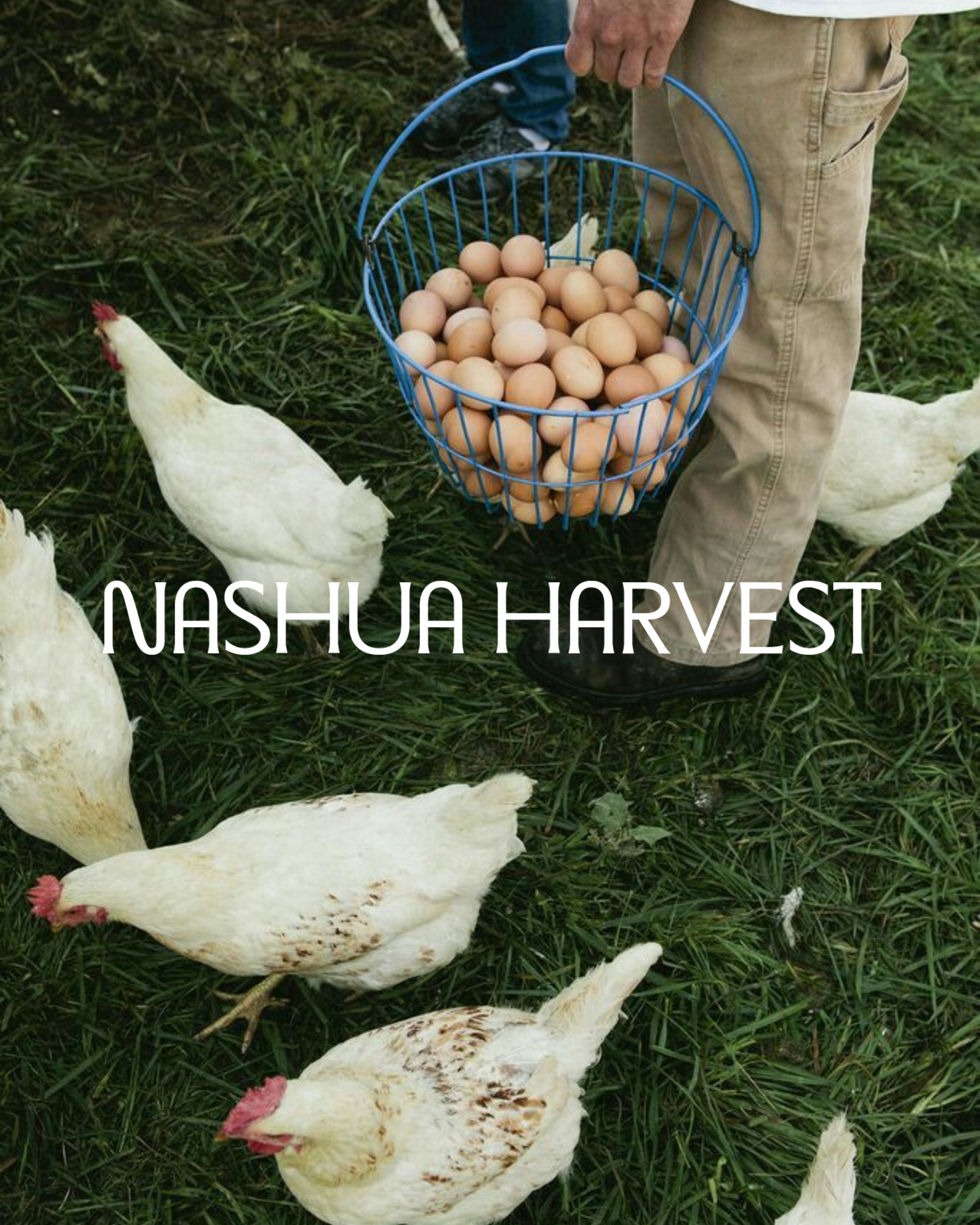
Perhaps my favourite part of the project was defining the visual world beyond the logo. Photography became less about perfectly styled produce and more about documenting process. Hands, tools, textures, harvests and natural light all contribute to an identity that feels lived in rather than manufactured. The result is a brand that values honesty over perfection and substance over spectacle.
Unlike many branding projects, this wasn't the end of my involvement. I'll continue working alongside Nashua Harvest as Brand Manager, guiding the ongoing evolution of the brand across marketing, content, product launches and creative direction. For me, that's the most rewarding part of the process. Watching a brand move beyond concepts and into everyday practice, growing season by season while staying true to the principles it was built upon.
Nashua Harvest isn't simply a farm brand. It's a long-term practice built around land, craft and thoughtful production. I'm excited to continue shaping that story as it grows.