Jack Cox Tennis
Some projects feel less like client work and more like an ongoing creative conversation.
I've known Jack for almost a decade and have worked on a number of projects with him over the years. This latest identity marks the launch of Jack Cox Tennis Pty Ltd, creating a brand that feels as individual as the person behind it.
The easy route would have been to lean into traditional tennis branding. Instead, I wanted to capture Jack's personality. Alongside coaching, he's a DJ with an alternative style, so the identity needed to sit somewhere between sport, music and culture rather than feeling overly corporate or performance driven.
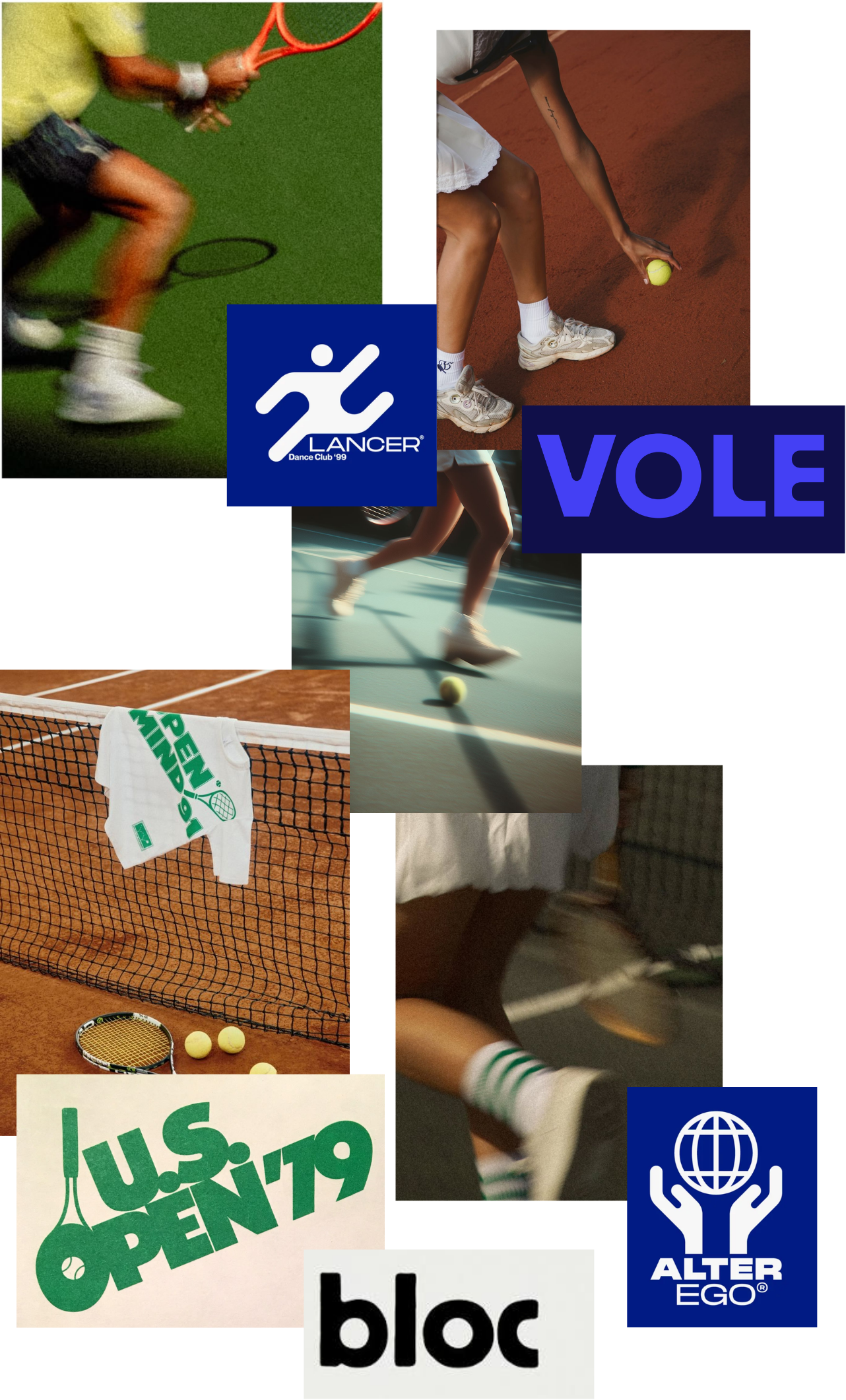
The mood board focused less on existing tennis logos and more on energy. Editorial sports photography, motion blur, vintage graphics and bold typography helped shape a visual language that felt youthful, expressive and full of movement.
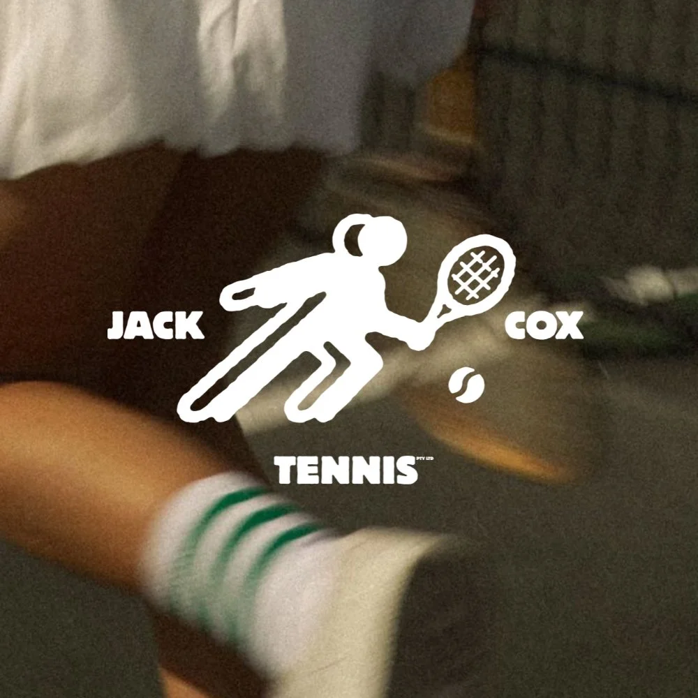
Movement became the foundation of the logo itself. I illustrated an abstract tennis player mid swing, simplifying the figure into bold graphic forms that feel dynamic, memorable and versatile across apparel, merchandise and digital.
While the identity pushes beyond the expected, it still stays grounded in tennis. Familiar court greens, clay inspired tones and subtle tennis references throughout the suite keep it connected to the sport without relying on clichés.
Knowing Jack, I also knew one logo wouldn't be enough. Rather than creating a single lock up, I designed a flexible suite of four variations, allowing the brand to adapt across different applications while maintaining a recognisable visual identity.
The result is a brand that feels true to Jack. Creative, energetic and a little unexpected. A tennis identity that feels just as comfortable on court as it does on a record sleeve.