Friends of Nabuapaka
Some brands exist to sell a product. Others exist to carry a purpose.
Friends of Nabuapaka is one of those.
The charity has been quietly changing lives in Papua New Guinea for many years through school sponsorships, medical outreach and community-led projects. Each year, volunteers travel to Nabuapaka with a doctor and nurse, delivering health checks alongside donated school supplies, clothing and essential resources. Through ongoing sponsorships, hundreds of children have been able to attend school with the supplies they need. The organisation has also played a role in rebuilding the local school and supporting infrastructure projects that directly benefit the village.
For me, this project was deeply personal.
My grandmother founded and continues to run Friends of Nabuapaka after forming lifelong connections in Papua New Guinea many years ago. Watching the work she has dedicated herself made this project feel less like client work and more like contributing to something that has been part of my family's story.
The challenge wasn't to reinvent the charity. It was to give it a visual identity capable of carrying its next chapter.
While the work happening on the ground is extraordinary, the organisation hadn’t been intentionally branded. I wanted to create an identity that could increase recognition, build trust with potential sponsors and create a stronger foundation for future fundraising, partnerships and awareness.
Rather than drawing inspiration from other charities, I looked to the place itself.
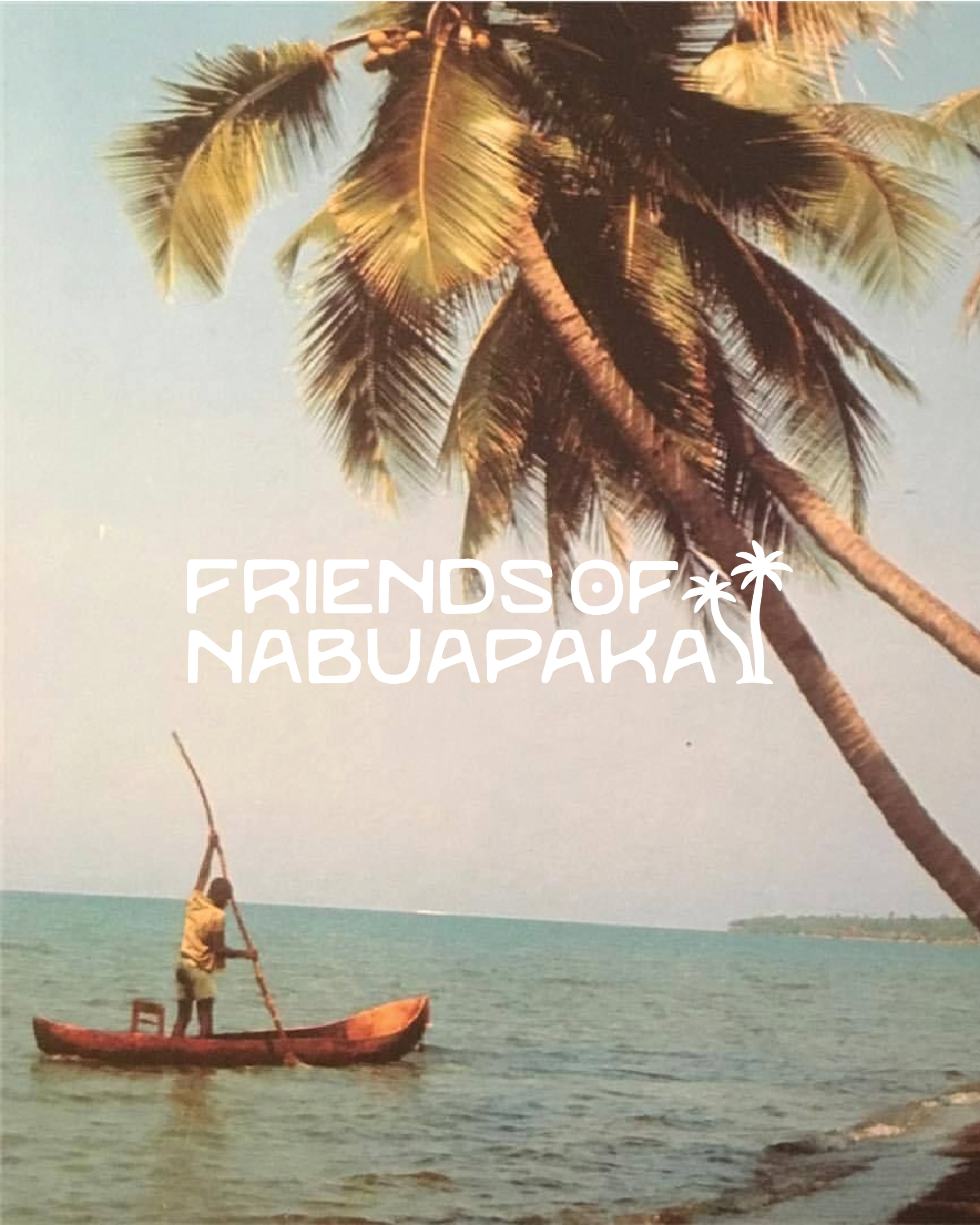
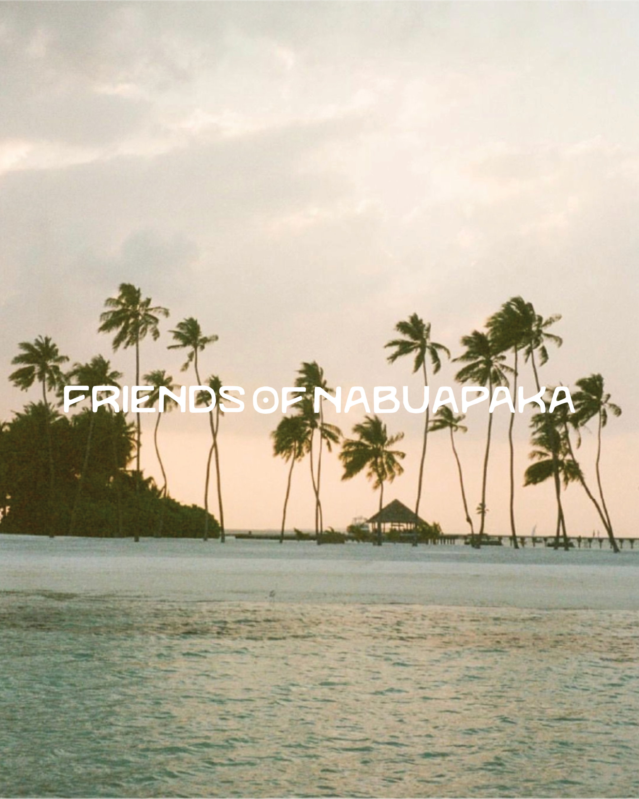
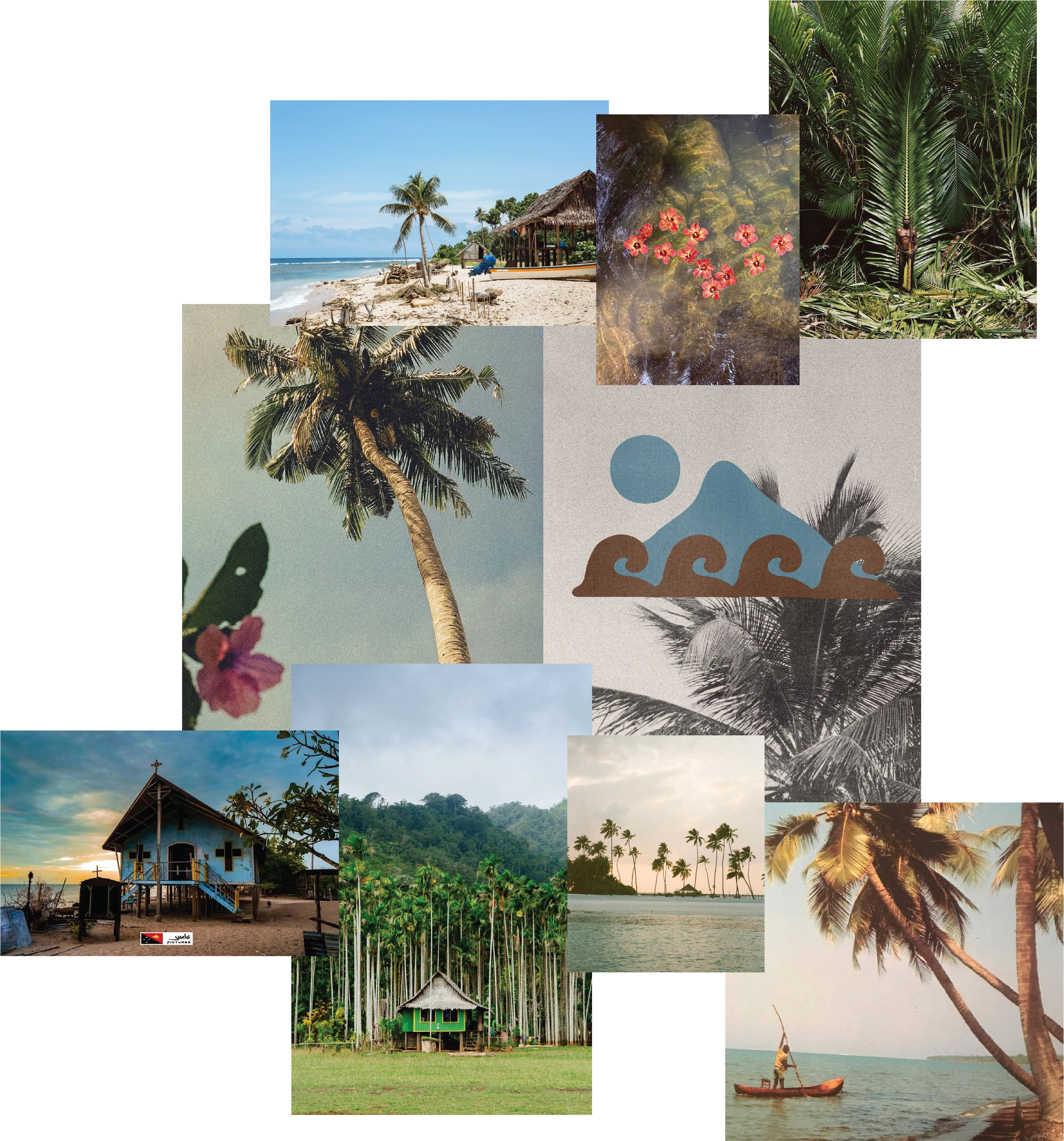
The mood board became an exploration of Nabuapaka's landscape. Towering palms, tropical waterways, village architecture and the rhythm of coastal life all informed the identity. I wanted the brand to feel optimistic and welcoming while remaining grounded in its environment, avoiding the visual clichés often associated with charity branding.
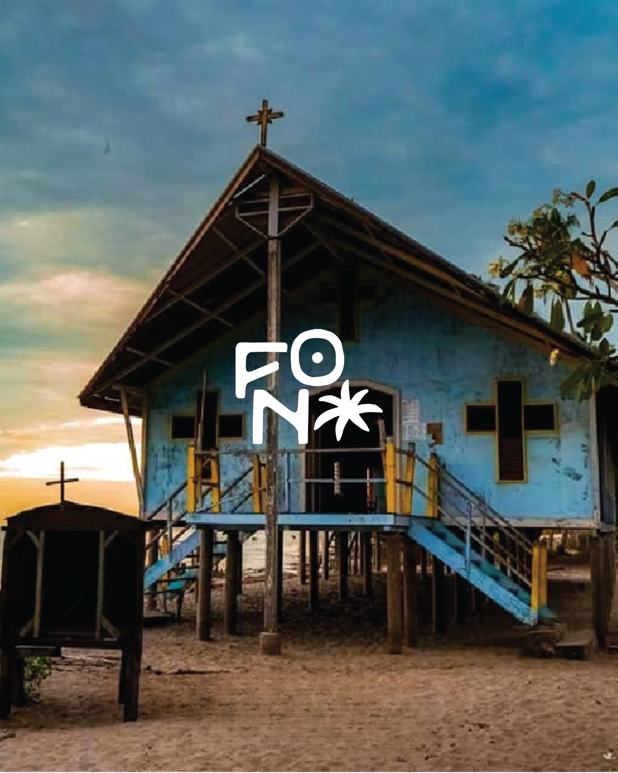
The colour palette pays homage to the village itself. Warm earth tones reference the surrounding landscape, palms and natural materials, while soft blues draw inspiration from the ocean and the distinctive blue church that sits at the heart of the community. Sunset tones introduce warmth and hope, creating a palette that feels vibrant without becoming overwhelming.
The logo follows the same philosophy. Simple, approachable letterforms are paired with custom illustrations of palm trees, creating an identity that feels connected to place while remaining highly adaptable across merchandise, fundraising materials, digital platforms and community events.
This project wasn't about creating something more polished. It was about creating something more memorable. A recognisable identity gives people something to rally behind. It helps tell the story before a single word is read and creates consistency across every future touchpoint.
I hope this brand helps Friends of Nabuapaka continue doing what it has always done so well: creating opportunities for children, supporting a remarkable community and building relationships that span generations.