Lume Studio Byron Bay
Sometimes a rebrand isn't about changing who you are. It's about finally reflecting who you've become.
Lume Studio began as FOUR65 Studio, a naturally lit content space named after the address it called home. As the business grew, so did the vision. When the opportunity arose to move into a new industrial warehouse, it became clear that the brand had outgrown both its environment and its name.
The new space marked a complete shift in direction.
Where FOUR65 embraced bright white walls and a soft, lifestyle aesthetic the new studio introduced concrete floors, architectural textures, chrome finishes and a more editorial point of view. It felt calmer, more intentional and ultimately more aligned with the brands and creators we wanted to attract.
Rather than simply renaming the business, I saw the move as an opportunity to completely reposition it.
The name Lume was chosen as a reference to the studio's defining feature: light and the pre-existing lighting hire sister company Lume Supply. More than a physical characteristic, light became the central idea behind the brand. It informs the way the space is designed, the way content is created and the experience every client has from the moment they walk through the door. This philosophy became the foundation of the brand strategy, positioning Lume as a studio where light leads and simplicity elevates the final result.
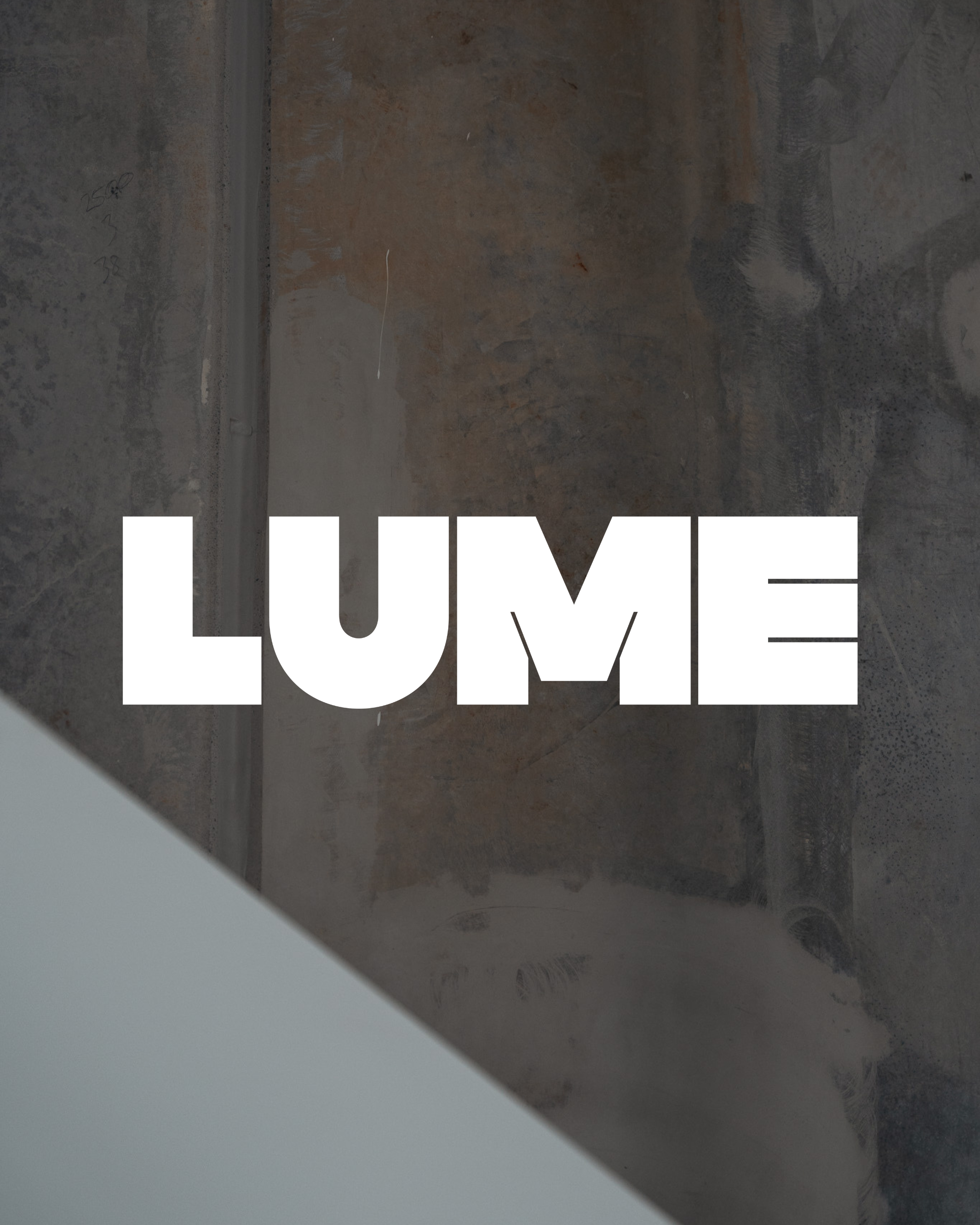
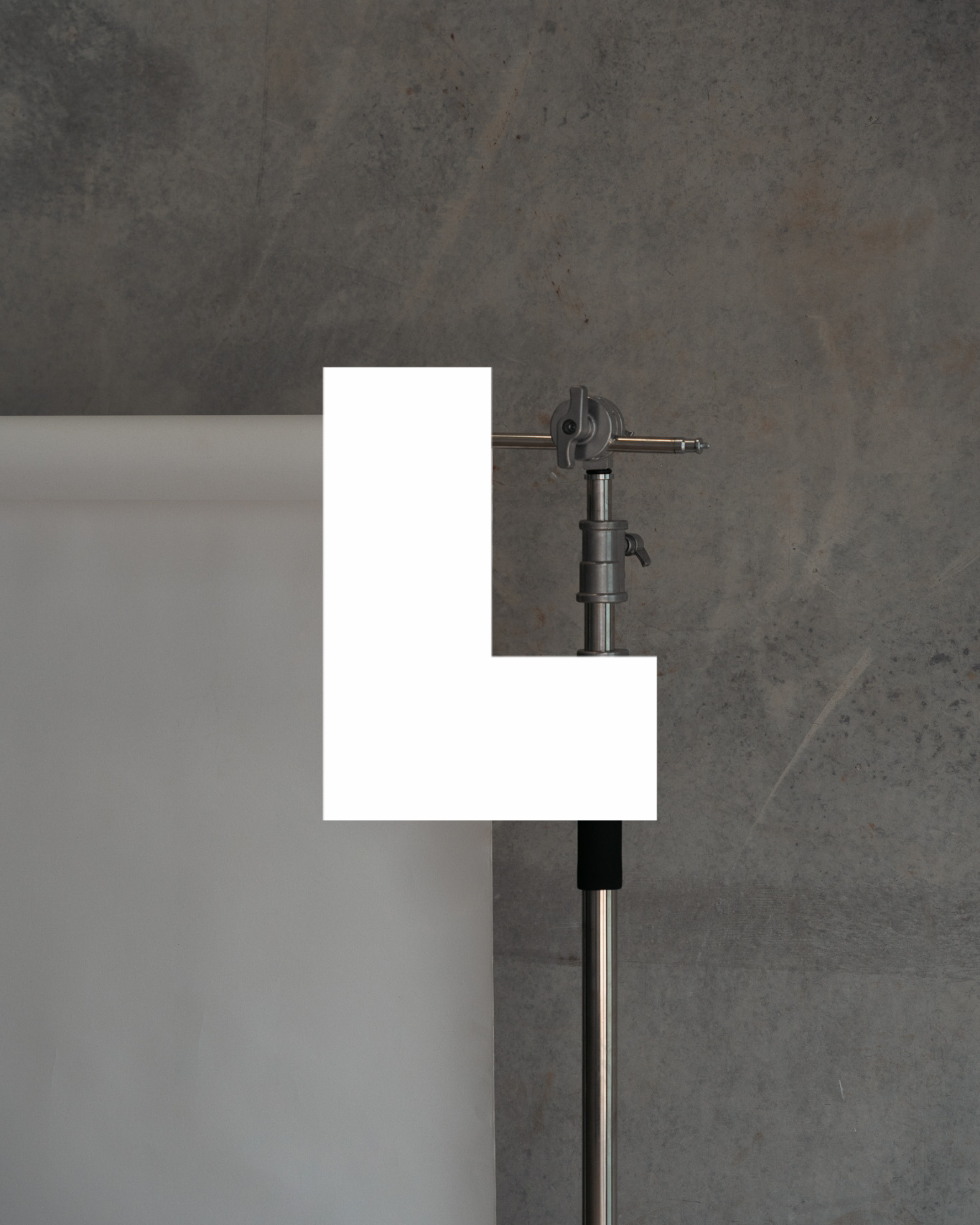
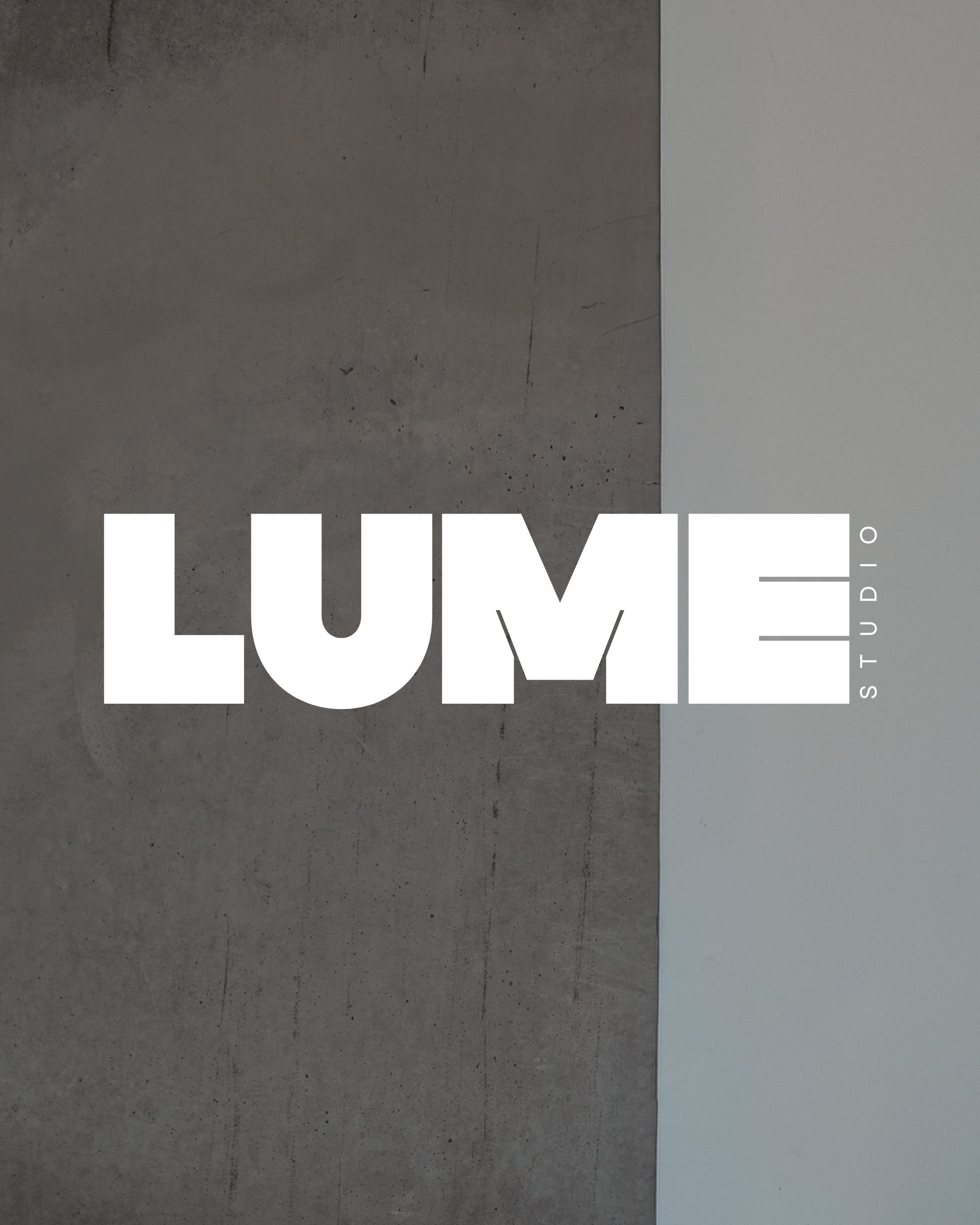
The visual identity reflects the architecture of the space itself. The logo uses bold, structured letterforms inspired by the clean lines and geometric forms found throughout the studio, creating something confident, modern and instantly recognisable. A simple "L" submark extends the system across signage, digital platforms and merchandise, allowing the identity to remain flexible without losing impact.
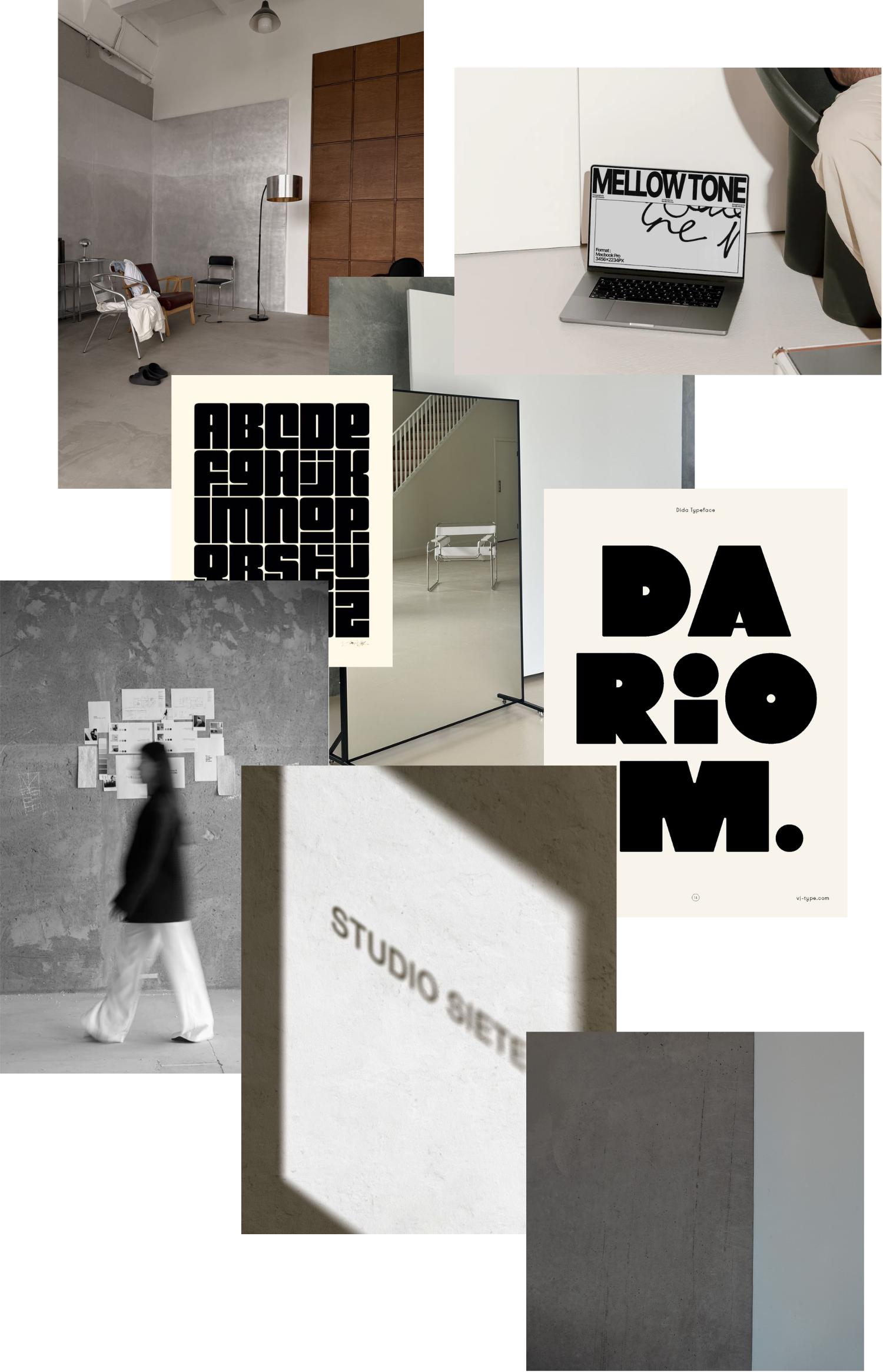
The mood board focused on restraint rather than decoration. Contemporary interiors, sculptural furniture, considered typography and premium editorial studios all helped shape a visual language that feels calm, architectural and quietly confident.
That thinking extends beyond the logo. I developed a complete brand system including positioning, messaging, typography, colour palette, website direction, merchandising philosophy and brand guidelines, ensuring every touchpoint feels cohesive and considered.
Unlike many branding projects, this is a business I continue to co-own and operate. The identity isn't something that was designed and handed over, it's something I actively steward. From marketing campaigns and social media to content creation, partnerships and the ongoing evolution of the physical space, the brand continues to grow through the same philosophy it was built on.
Lume Studio isn't simply a place to hire. It's an environment intentionally designed to elevate the work created within it. For me, this project represents the intersection of branding, spatial design and creative direction, proving that the strongest brands are shaped as much by experience as they are by visuals.