That PR Girl

Sometimes the biggest branding opportunity isn't creating something new. It's recognising when an existing business has outgrown the way it's being presented.
That PR Girl began as a strategic repositioning project. Lauren had built an exceptional reputation in public relations while operating under Always Keen, a production company best known for video and television. While the two businesses naturally complemented one another, it became clear that her PR offering deserved an identity of its own. One that communicated her expertise immediately, reduced confusion in the market and allowed both businesses to thrive independently while continuing to work together as complementary partners.
The project began with strategy.
Before exploring logos or typography, we worked through the positioning of the business, defining its audience, point of difference and how it should sit alongside Always Keen rather than compete with it. The result was That PR Girl, a name that felt memorable, approachable and instantly communicated exactly who Lauren was and what she offered.
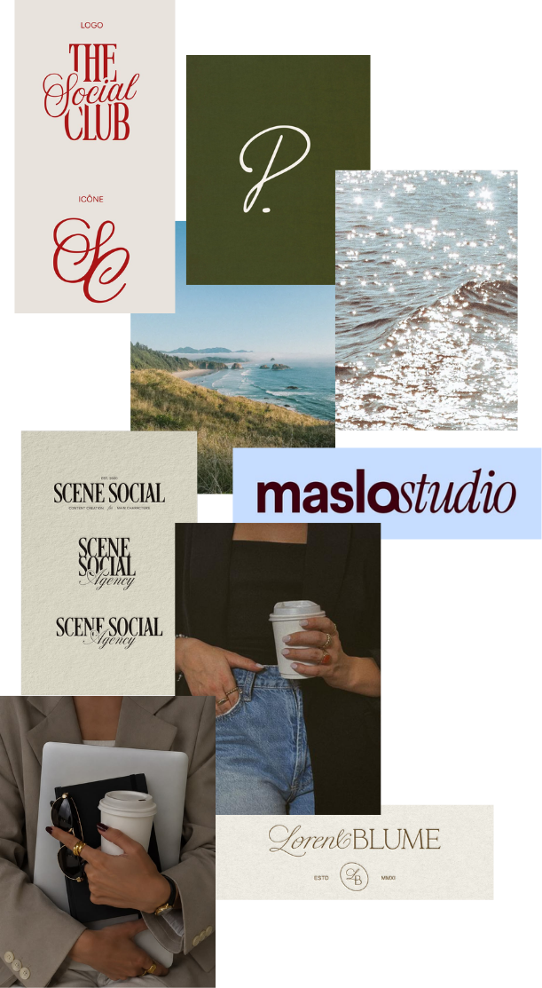
Visually, the identity needed to reflect the way Lauren works. The mood board drew inspiration from editorial publishing, boutique creative agencies and timeless typography, creating a brand that felt polished without becoming corporate. Rich tones, soft neutrals and elegant typography positioned the business as both professional and personal, mirroring Lauren's relationship first approach to public relations.
The logo balances structure with personality. A refined serif wordmark is paired with expressive script, creating contrast between strategic thinking and human connection. It's a visual identity that feels confident, contemporary and approachable while remaining timeless enough to grow with the business.
Beyond the branding, this project was about giving Lauren a platform to showcase her work. With a clear identity and dedicated positioning, That PR Girl could communicate its services more effectively, build credibility and establish a stronger presence within the market.
The impact was immediate. Within weeks of launching, the business began onboarding new clients, validating the strategy and proving the value of creating a brand that clearly communicates both expertise and purpose.
For me, this project is a reminder that branding isn't simply about aesthetics. It's about creating clarity. When people instantly understand who you are, what you do and why it matters, opportunities naturally follow.